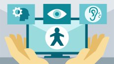
When we say a website is accessible, it means anyone, regardless of the disability can access it, understand it, and interact with it using different forms of assistive technologies. Having inaccessible web content (websites, applications, and everything in it) means shutting the door of your website to a large part of the population who suffer impairments that affect access to the web such as visual, physical, cognitive, and auditory. Similarly, a website may be inaccessible to non-disabled users- web users in a noisy environment, people with a slow internet connection, users with small display devices such as smartphone users, etc. By having an accessible digital offering, your audience can consume your content, make use of your services, or purchase your products, regardless of their device or disability. Apart from the many disadvantages that having an inaccessible website brings (suffering a boycott from those with disabilities, old people, and their relatives), it is unethical and illegal to discriminate against people due to their disability. Thankfully, a lot of countries now have different accessibility laws that cater to their citizens with disabilities. Many of these come with fines and penalties too.
✔️ Check out Web Content Accessibility Guidelines 2.1 Checklist [With images of Bad and Good Examples]
The United States of America has about 1 in 5 adults with a disability and majorly employs the Americans with Disabilities Act (ADA) and Section 508 as non-discrimination and digital accessibility laws. Government organizations operating within any EU member state must abide by the directive – EN 301 549 to make websites accessible. Germany makes use of Barrierefreie-Informationstechnik-Verordnung (BITV 2.0) and the EU directive to mandate public and federal agencies with their vendors, contractors, and partners to create websites, mobile applications, and electronically supported administrative processes accessible to people with disabilities. The Accessible Canada Act (Bill C-81) and AODA regulate organizations in Canada and Ontario with a penalty of around $250,000. The U.K. has the Equality Act, as do many other countries with digital accessibility laws that govern its public and private organizations. The majority, if not all of these country-specific digital accessibility laws have referenced the international standard for making web content accessible to people with disabilities, the Web Content Accessibility Guidelines (WCAG) 2.0 Level AA. The WCAG standard presents three levels of accessibility compliance. Level A is essential for assistive technology users. Level AA offers the ideal support, while the most advanced Level AAA provides high-level support for sites that specifically serve a specialized audience. Hence, to make your website accessible and compliant, all you have to do is follow the WCAG 2.0 Level AA guideline, regardless of your country.

The ideal and sustainable process to have an accessible website will be to perform an assessment, remediate the site, and perform validation. You then have to train your development team to design with accessibility in mind, perform periodic testing against WCAG 2.0 Level AA standard, integrate accessibility in your processes, and draft a maintenance plan. It certainly takes time to make your website accessible with the technicalities and complexities of WCAG but the benefits of providing disabled access are worth it. Hence, this list will be looking at the relatively easy adjustments your web coordinators can make to remove accessibility violations and improve the experience for everyone who interacts with the site.
Based on the WCAG 2.0 AA standard, the below ADA compliance website checklist doesn’t guarantee your site will be accessible but addresses a few accessibility issues and contains the most common errors and blockages people with disabilities face when interacting with websites. However, I should reiterate that a more robust evaluation is needed to assess accessibility comprehensively.
Identifying Your Current Digital Accessibility Status
In no particular order, below are ten essential parts of a website you can check and alter to make your website accessible to people with disabilities and compliant with accessibility laws.
Images
Images are a prevalent part of a website. Hence, it is crucial everyone can enjoy them. So how do you achieve this?
Provide text alternatives (alt-text): Information can be communicated via an image (pictures, illustrations, charts, etc.) for users to understand the web page content, hence, it must have a textual equivalent for visually impaired users who use screen readers to hear the content. Having a functional alternative text can also provide an equivalent web experience by conveying the image’s purpose to people with low bandwidth who have turned off images in their browsers.
Tips:
- Purely decorative images that users do not need to know about should have an empty or null alt text (alt=””) to avoid repetition.
- Alternative text should depend on the context.
- For images containing text, e.g., in a logo, that text in the logo should be included in the alt text. Similarly, functional images that initiate actions, e.g., navigation (such as home page), should have a functionally equivalent alt text such as alt=”home page”.
- For graphical images or charts, provide a short alt text to identify the image and a detailed description elsewhere (for example, in a data table).
Contrast Ratio (luminance contrast)
It is essential to ensure all users, including those with color vision deficiencies such as older people or people with low vision, can read the text by checking contrast ratios early on in the design and development processes. Good luminance contrast or color contrast is sufficient contrast between the text and background, thereby making the text distinguishable.
Tips:
- The WCAG 2.0 AA standard requires a contrast ratio of at least 4.5:1 for normal text and at least 3:1 for large-scale text and images of large-scale text (logos and ‘incidental’ text are exempt).
Keyboard navigation and visual focus
Keyboard access is particularly essential for web users with visual or mobility impairments who cannot use the mouse, hover, or perform precise clicking to interact with the web. These users rely on the keyboard and assistive technologies such as screen readers to operate and navigate all content and functionality.
Tips:
- Web pages and elements such as forms, media controls, links, etc. must be navigable using “Tab”, “Shift+Tab”, “arrow keys”, and “Enter”.
- The keyboard focus (border or highlight) should be visible as you navigate through elements.
- The keyboard tab order should follow a logical reading order.
Forms, labels, and errors
For accessibility, forms (text fields, radio buttons, checkboxes, drop-down lists, etc.) that allow people to enter information into your website or processing and manipulation must have visible labels. The labels (explain what data is to be put in the form) must be immediately next to the text fields people are supposed to type in or click. This way, people with disabilities who use the keyboard or other assistive technologies such as voice input or screen readers can interact with them.
Tips:
- Form labels should be keyboard accessible.
- Form labels should follow a logical layout.
- All form fields that are required/mandatory should be clearly indicated. The indicator, such as asterisks (*) should not be visually communicated via color alone to be accessible to people with color blindness. Similarly, any instructions for completing the form should be stated, and required formats, such as dates (year-month-date in the format 0000-00-00), should be included in the marked-up label.
- Errors should be easily findable. More so, provide clear and specific guidance to help people understand and fix the error.
Moving, Flashing, or Blinking Content (Animation)
Content on the site that moves, when triggered by a person activating a control or on its own such as ads, scrolling news feeds, videos, auto-updating stock tickers, etc must be controllable by the web user, especially those with attention deficit disorder or visual processing disorders. Bright, large enough, and rapidly blinking contents could trigger seizures in someone with photosensitive epilepsy. Similarly, some of your visitors will have a problem understanding moving information. Simultaneously, some will find focusing and reading elsewhere difficult due to moving content on the same page (users with cognitive disabilities such as ADHD).
Tips:
- Ensure animations are subtle and no content flashes or blinks more than three times per second.
- Provide a mechanism for users to control the time limit or frequency (pause, stop, or hide) or the movement of moving, blinking, or scrolling information that starts automatically and lasts more than five seconds.
Multimedia (video, audio) alternatives
It is essential to perform video and audio-specific checks to allow blind users or those with low vision and users who are deaf or hard of hearing, respectively, to understand the video or audio content. This is by providing alternative formats such as captions or audio and text transcripts.
Tips:
- Audio (such as background noise and video with sound) should not start automatically when a web page opens. If it must, then it should include controls to pause or stop it, controls to turn down the volume, or must stop after three seconds.
- Have captions/subtitles, also known as “closed captions,” should be provided in the specific language and must be in sync with the spoken content.
- Have an audio description that describes the essential visual information in a video.
- Transcripts describe meaningful visual information and should be easy to find near the audio/video itself.
Page Titles
Page titles are shown in the title bar in browsers or shown in the browsers’ tabs when multiple web pages open. Page titles must be brief and descriptive enough for screen readers to interpret to their users. A page title helps blind users know the page they are on and to move between pages opened in the browser since it is the first thing screen readers say when the web user goes to a different web page.
Tips:
- Listen to your pages with a screen reader and ensure the title adequately and briefly describe the page’s content.
- Check pages of your website and ensure each page title is adequately different from other pages on the website.
- It is best your page titles are “front-loaded” with the crucial and unique identifying information first, e.g. Contact Us- WhoisAccessible.com.
Link Information
A unique, descriptive, and identifiable link text is essential for all users. Links on the web page should describe the link or its purpose and where the link is going. A page filled with link text saying “Click here” or “Read more” is non-distinguish and won’t help anyone, more importantly, screen reader users who can quickly see a list of links on a page.
Tips:
- It is best to leave your links underlined when a non-mouse user focuses on it from the keyboard, stylus, or voice input. This will ensure that web users with low vision or color blindness can differentiate between the link and text when they hover or focus.
- Your links should have a 3:1 contrast ratio from the non-link text surrounding them.
- If you link a file e.g., a document or video, ensure to state the type of document and file size.
- Let users know if the link opens to a new tab or file to let them choose to go to the new destination.
Headings and Landmark
It is usual for blocks of text to be separated by visual headings and bulleted lists. To make the sections of information navigable by disabled users that access the page via keyboard and screen reader users, headings must be marked up. This ensures users can understand your web page’s structure, quickly navigate around the page, and past blocks of content.
Tips:
- Ensure all pages have a heading
- To help assistive technology users, ensure your heading levels have a meaningful hierarchy. An ideal page should start with an “h1”.
- Texts that look like a heading should be marked up as a heading and should be a conceptual section heading.
Appearance of Content
This relates to how web content looks in any situation (change of font, text size, page zoom, space between lines, etc.) initiated by web users. Some web users depend on screen-zoom software and will need to enlarge web content to read it. Hence web content must be readable and appear in a proper structure; otherwise, it becomes unusable when it overlaps.
Tips:
- When a web page’s text size is enlarged, ensure text does not disappear or get cut off. Ensure all text in the sentence is visible.
- Ensure text is provided in actual text format and not image format
- Ensure web content such as text and images do not overlap
- Controls such as buttons and form fields should be visible and usable.
- For your web page, use a consistent and straightforward layout.
What to Do
As you can see from the website accessibility checklist, most accessibility barriers are caused by poor web design and development. More of this has been covered under accessible web design and development. The accessibility checks on this page are not definitive; passing them does not translate to an accessible site. This is where the WCAG 2.0/2.1 guidelines will come in handy.
Once you can complete the necessary accessibility checks with this checklist, you’ll have a good idea of your web pages’ accessibility issues. As a website owner, you want to thoroughly audit or evaluate the site- a comprehensive check of your website against the WCAG 2.0/2.1 Level AA standard. You can find out what that entails in a separate article on accessibility audits. As web users, you want to contact the organizations, reporting inaccessible web pages or accessibility problems.
Let me drop this infographic with a few tips to make your website accessible here. 
Description
Title: TIPS TO MAKE YOUR WEBSITE ACCESSIBLE
Web accessibility is the inclusive practice of ensuring people with disabilities can understand, navigate, and use the web. One should not wait for a lawsuit to ensure WCAG, ADA, and Section 508 Federal standards compliance.
Here are some five routes of doing this.
KEYBOARD ACCESSIBLE
Your website must be navigable using only a keyboard. Keep in mind that blind users and users with motor disabilities rely on a keyboard for web navigation
TEXT SIZE
Use an adequate font size. Confirm text size and contrast against compliance standards to help users with visual impairments and the old age.
MULTIMEDIA CAPTIONS
Provide captions and transcripts for multimedia. Provide a transcript for audio and video files to help users with hearing, and visual impairments.
IMAGE ALT TEXT
Add alternative text to images. Use ALT text to describe the information of images, video, and audio to help users with visual and hearing impairments.
MEANINGFUL LINK TEXT
Every link’s purpose should be determined from the link text or its context. Make sure links are recognizable for all web users.


