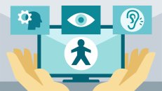
Accessibility or “A11Y” as popularly abbreviated is the inclusive practice of ensuring users with disabilities can access the content. It is simply ensuring your website and applications are accessible to everyone and can be operated by anyone.
- When sites are correctly designed, developed, and edited, all users have equal access to information and functionality.
- Web accessibility caters to the experience of users outside a narrow consumer range.
- Accessibility makes a page easier to navigate and leaves less room for mistakes.
PS: “a11y” is a shortened version of the word “accessibility”. It is a numeronym where letters between the first and last letters are replaced with a number representing the number of letters omitted.
Everyone has experienced not being able to access the web, either through an inaccessible user interface or not being able to see a video or content because of your country or location. To further understand what we mean by web accessibility, let’s go through two web page images as an example of experiencing inaccessible web content.
 The web page image above is filled with accessibility barriers in that;
- The username text and texts in the price detail are on low contrast – this makes it hard for low-vision users to read.
- Having the form labels wide apart makes it hard for most people to associate them.
- The label is not correctly associated with the checkbox. You also have to specifically click the tiny box rather than the whole label.
Hence, the webpage is not accessible as it makes it difficult or impossible for some people to use it.
Now let’s take a look at an accessible version of the same web content.
 In the image above;
- The low contrast is darker
- The designs have been modified so labels are right next to things they’re labeling
- The label is now associated with the checkbox and can be checked by clicking anywhere around the label.
An average user will be much more comfortable using the accessible version, right?
In summary, while addressing accessibility will avoid excluding specific categories of people from accessing content, it also ensures things will be better for everyone. These new adjustments will help web users with visual, cognitive, and dexterity impairments. At the same time, they will prevent a distracted user or someone in a hurry to avoid mistakes.
To understand web accessibility, it is only normal we take the concepts that surround it one at a time.
Disabilities that Affect the Use of the Web
Web accessibility in itself encompasses major disabilities that affect access to the web, including:
- Visual impairments: Total blindness, low visual acuity, poor color vision, and individuals with temporary challenges. Web pages must be comfortable for screen readers or provide a braille alternative. Useful alternatives include text-to-speech and text-magnifying functions.
- Motor or dexterity impairments: People with a broken arm, Repetitive Strain Injury (RSI). The website must be keyboard-accessible, and accommodate voice dictation, etc.
- Hearing impairments: Complete or temporal deafness. Websites should present a visual alternative for sound such as a flashing alert.
- Cognitive impairments: People with ADD, and dyslexia. Websites should provide accommodations for zooming etc.
Web Accessibility Standard and Checklist
To ensure the Internet is accessible to people with disabilities, the World Wide Web Consortium (W3C) established the Web Accessibility Initiative (WAI) in 1997. WAI has different working groups among which is the Accessibility Guidelines Working Group (AG WG) which created what would later become the international standard for web accessibility called the Web Content Accessibility Guidelines (WCAG). The WCAG guidelines are organized under 4 principles, also known as POUR;
- Perceivable – Web content, information, and interfaces must be presented in a way that all users can easily perceive.
- Operable – Users must be able to navigate the user interface.
- Understandable – All information, and design within a website should be easily readable and understandable.
- Robust – All web content on a website should be accessible to users of assistive technology.
The WCAG guidelines, over the years, have been updated to version 2.0/2.1 Level AA standards. To know more about the WCAG principles, I recommend you see How W3C and WAI Standards Help Create Accessible Designs. The guidelines and best practices put together by a11y experts have been adopted in the U.S.A. through the Americans with Disabilities Act (ADA) and Section 508 among other countries with several international digital accessibility laws.
Accessibility Compliance
When websites and mobile applications are accessible to people with disabilities and meet the standard for accessible design and development, such as WCAG 2.0/2.1 Level AA, it is accessible and compliant with regulations. For information on ADA compliance, and 508 compliance, see Accessibility Compliance: How to Get Started.
Accessibility Testing, Audit, and Remediation
Even after your site has been designed and developed to be accessible and compliant, you need to make sure they remain accessible. It only requires a little improper update to cause an issue and leave the site inaccessible. Hence, the a need to perform periodic testing to identify issues that could arise. For a comprehensive accessibility audit, automated testing is carried out using accessibility testing tools, along with manual audits by accessibility expert testers who access the site like a disabled user and review your codes. The audit report is used to remediate the site with the ultimate aim of making your site accessible and compliant.
Again, ongoing monitoring is essential to continue to ensure your website remains accessible and this is where having an accessibility statement comes in. The accessibility statement tells your users about the website or app’s level of accessibility, potential barriers, how to get in touch for an alternative format, and level of compliance with a11y standards such as WCAG 2.0 Level AA, Section 508, EN 301 549, etc.
Accessibility Solutions
Because web accessibility can be technical, you can choose to outsource your compliance with specialized web accessibility solutions providers. The solution can be manual, automated, or a combination of both depending on your available resources, your accessibility goals, and the style of accessibility integration in the organization.
Benefits of Web Accessibility
Providing disabled access benefits people and businesses but primarily benefits people with disabilities such as access to people with cognitive, auditory, physical, visual, or neurological impairments. It benefits hand-held device users such as people using mobile phones, smart TVs, smartwatches, etc. An accessible website also helps people with a slow internet connection, old people whose abilities change due to aging, people with “temporary disabilities” such as someone with a broken arm or lost glasses, or those with “situational limitations” such as someone in a noisy environment that makes it difficult to listen to audio or someone in bright sunlight. In addition, providing disabled access protects organizations against lawsuits.
Elements of Creating Accessible Websites
This simple, non-technical guide takes a bit from the Udacity Web Accessibility Course by Google to make understanding easier.
I recommend you refer to our WCAG 2.0/2.1 article for practical details on how to create accessible designs. This section will only cover:
- Focus: This will help build websites that can be operated with a keyboard and enable users with motor impairment access.
- Semantics: – This is to ensure the site is expressed in a robust way to work with various assistive technologies.
- Styling & visual design: This ensures a visible user interface (UI) is as flexible and usable as possible.
Focus
Focus is essential for web users who cannot use a mouse or pointing device. Good focus ensures users with disabilities can drive through your website entirely with a keyboard or other input device.
All page functionality should be available through the use of a keyboard unless the feature cannot be accomplished in any known way using a keyboard (an example of this is in the case of drawings).
Focus determines where keyboard activities/events go on the page. Let me show you…

In the web page image above, the currently focused item is indicated by the ‘focus ring’. The focus ring is on “Departure Date”, using the keyboard (by pressing tab), the next focus item will be on ……………….? Yes! “Return Date”.
Using the keyboard, one can determine focus in the Udacity footer links.

Focus items can be navigated with a keyboard using the tab key to move focus forward, shift+tab keys to move focus backward, and arrow keys to move focus within a component. This order is called the Tab Order.
Focusing Techniques
- The forward and backward movement of focus is called the Tab Order.
- Not all elements on a webpage are focusable. There’s no need to focus if a user doesn’t have to interact with it or provide input.
- The focus should only be added to interactive controls like buttons, tabs, dropdowns, and anything the user may provide input to.

- Skip links are hidden links that allow keyboard and switch device users the ability to jump straight into the web content. They help all users, including those with a motor impairment who can’t move their hand or use a mouse, navigate through the heart of the page faster. Imagine someone with no arms who accesses the website by head taps having to tap the head multiple times scrolling through too many sidebars, sublists, menus, etc before getting to the main content. Not so cool, right?
| Bad (a web page with many repetitive links) | Good (a web page with a bar for skipping repetitive links – skip to main content) |
|---|---|
 |
 |
- The keyboard trap happens when the keyboard focus is trapped on a particular page element. This is simply when the focus ring refuses to move even when you press the tab button on your keyboard. This can be frustrating for keyboard-only users. In fact, Section 2.1.2 of the WCAG checklist states that the keyboard focus should never be locked or trapped at any one particular page element.
Semantics
Semantics are tools designed to help people whose impairments can prevent them from accessing information technology. They are assistive technologies such as screen readers, voice control, magnification, eye tracking, braille display, etc.
Therefore, ensuring a website or application supports assistive technologies depends on programmatically expressed semantics.
- It is essential to express information in a flexible way to be accessed programmatically by assistive technologies.
- A screen reader largely creates the user interface for the user based on the programmatically expressed semantics hence the importance of Name, Role, State, and Value. In order words, an accessible page will enable the screen reader to state information about the element’s name, role, state, and value.
- Text alternatives: all images should have an alternative (alt) attribute, and important images should have descriptive alt text that describes what the image is while decorative images should have blank alt text. Here, imagine closing your eyes and having someone tell you what is on the web page. That is exactly how blind people who rely on screen readers access your site.
| Bad (ALT text: Credit cards (which ones?) | Good (ALT text: Visa and MasterCard (conveys specific cards) |
|---|---|
 |
 |
- Using Headings to Navigate: Many screen readers rely on headings to navigate through a page and find content. Hence, the importance of using headings to lay out page structure. Headings must be appropriate to ensure good accessibility.
- Link Text: Link Text must be descriptive. The purpose of each link should able to be determined from the link text alone. This means link text should give the user enough information to decide whether or not to click it.
| Bad (the purpose of the link cannot be determined from the link text) | Good (the purpose of the link can be determined from the link text) |
|---|---|
 |
 |
Style
Adding styles helps us support the accessibility work that is being done. This includes adding styles for focus, ensuring our user interface is flexible for various uses by users with disabilities, and using color on the site.
- Working with Focus Styles: the page element with the current keyboard focus should be visually apparent current keyboard focus as you tab through the page.
- Responsive design for multi-device: improves the experience on a website for all users across multi-devices. A responsively designed web page will zoom in for users who have difficulty reading the small print and require screen magnification.
- Meeting Contrast Requirements: Contrast ratio is the relationship between the foreground color and the background color in terms of luminance. Very similar colors mean we have a low contrast ratio and when the colors are very different we get a high contrast ratio.

Summary
The concept of web accessibility goes beyond benefitting people with disabilities. It assists non-disabled users and increases usability for all users. You can read more on the cross-functionality in a separate article What is Usability? How Does it Relate to Web Accessibility? Similarly, accessibility compliance is essential for organizations and businesses to avoid damage to brand reputation and increase customer base.
Monitoring your accessible website or mobile application (ongoing compliance monitoring) is equally as essential as being compliant itself, hence the need to integrate accessibility into the organization’s processes, and that includes training your IT team or outsourcing to dedicated accessibility audit and remediation solution providers.
There are a lot of accessibility facets worth considering in ensuring applications and websites are accessible to people with disabilities. An accessible web page must have a good focus strategy to enable visually impaired and keyboard users to interact with it. Web pages must also be compatible with various assistive technologies to enable a consistent experience for all users and it must meet a minimum color contrast ratio to ensure readability for everyone, particularly those users with any kind of vision impairment.
If web designers, developers, and content creators can keep all of these in mind and ensure good web design, our final product or site (website or mobile application) will reach more users, and those users will have a better time using the site.
Kindly share if this article helped you understand web accessibility.


