Web or Digital accessibility is about making information and communication available to everyone regardless of disability or other forms of barriers. Disabilities that affect the use of the web include visual and hearing impairment, physical or mobility-related disabilities, and cognitive impairments. To provide an equal web experience for these users, web designers, developers, and content authors are to reference the international standard for making the web accessible – Web Content Accessibility Guidelines (WCAG) 2.0/2.1 Level AA. The WCAG 2.0/2.1 standards have been adopted in many countries such as the U.S.A through the Americans with Disabilities Act and Section 508, Germany through BITV 2.0, Canada through ACA and AODA, and the EU member states with EN 301 549.
Web designers, developers, and content authors matter most here because accessibility is best when integrated at the very beginning of website design and development. What this means is that the most reasonable and cost-effective way to achieve it is during web design and development. To this effect, it is essential to initiate the concept of web accessibility in your team or across the organization in order to align everyone’s interests and deepen accessibility in the system. You can read about that in a dedicated article- Accessibility Compliance: How to Get Started.
To make everyone get the basics, you want to provide articles and resources, set up a screen reader and assistive technology demonstrations, and let members experience how real individuals with disabilities access the web or use digital technologies. This will surely help members understand the value of providing accessible digital content and with this, the concept of digital accessibility is grounded in the organizational approaches, processes, and practice.
Prioritizing web accessibility within your organization benefits both the organization and web users. Good web design provides a better user experience for the website visitor and it makes code maintenance easier for the organization integrating it. See Disabled Access: Why Make Your Website Accessible? for more on the benefits of web accessibility. When accessibility is prioritized, you can determine your website’s or app’s state of accessibility by carrying out an accessibility audit of your website at all stages of the process and identifying issues to be fixed or avoided.
Accessible Web Design and Development
So what are some basic considerations from the WCAG 2.0/2.1 Level AA requirements to kick start the process of making your user interface design and visual design (for designers) more accessible, and developing web content that is accessible to individuals with disabilities?
Contrast Problem
Given that insufficient color contrast is one of the most common failures of website accessibility, web designers should provide sufficient contrast between foreground text and background colors. This does not apply to text that is part of a logo or brand name or that is part of a picture. WCAG 2.1 Success Criteria 1.4.3, 1.4.6, and 1.4.11 specified this to help users with color blindness experience the web.
Use of Color
Web designers sometimes choose to go for ‘fancy’ over usability and understandability, hence, failing to consider the myriads of users with vision impairments or color vision deficiencies who access the website. To enable these users to complete their experience, do not rely too heavily on conveying information with color alone. That is, it is important to provide additional identification and discourage from referring to something or conveying meaning using color alone. WCAG 2.1 Success Criteria 1.4.1 specified this.
Interactive Elements
All page functionality should be available using the keyboard to provide access to assistive technology users who can not use a mouse. The majority of these individuals use the only keyboard to navigate through web pages, hence the importance of ensuring that interactive elements such as input, links, and buttons are implicitly focusable and are easy to identify. This is the only way users with a limited ability to use a mouse or older users with hand tremors can access your site with the keyboard tab button. Meanwhile, also ensure the styles and naming for interactive elements are consistent throughout the web pages. WCAG 2.1 Success Criteria 2.4.7, and 3.2.4 specified this.
Navigation Mechanisms
To ensure all users can understand the information and operation of the user interface, WCAG 2.1 Success Criteria 3.2.3 recommends ensuring navigation options across the website pages have consistent naming, styling, and positioning. WCAG 2.1 Success Criteria 2.4.5 also makes it important to ensure there is more than one way to locate a web page. That is, to provide more than one method of website navigation, such as a site map or site search to users with cognitive difficulties who sometimes find it difficult to understand where they are on a web page.
Headings, Labels and Form Control
Web designers should help users with cognitive difficulties by providing clear headings and labels that describe the purpose or topic. For accessibility, it is best to design and code descriptive labels adjacent (and close enough) to the fields. More so, when developing content that requires user input such as forms, it is recommended to code labels in a way that helps all readers understand the required input by providing labels or instructions for the web user. This is also one of the most common failures in web accessibility. Hence, WCAG 2.1 Success Criteria 2.4.6, and 3.3.2 specifications to help all users.
Easily Identifiable Feedback
It is true that addressing accessibility will avoid excluding certain categories of people from accessing digital content, it also ensures things will be better for everyone (abled and disabled users). This is why it is recommended to design websites to provide feedback for interactions such that input error is identified, and described in the text to the user with suggestions for correction. That is, provide a mechanism to notify the user of errors or changes on the page such as the use of an error list, identifiable icon, and background color to make errors stand out so as to help users avoid and correct mistakes. WCAG 2.1 Success Criteria 3.3.1, 3.3.2. and 3.3.3 specified this to help all users, including those with dyslexia.
Use of Headings and Spacing
To make the use of the web operable for everyone, it is essential to style headings and labels appropriately to organize web content and describe topics or purposes. Headings should be styled in such a way that it makes it easier to understand the relationship with content. This recommendation especially makes the web easy to navigate for everyone as specified by WCAG 2.1 Success Criteria 2.4.6, and 2.4.10.
Image and Media Alternatives
Missing alt-attributes is also one of the common failures recorded in web inaccessibility. Providing text alternatives for non-text (informational and functional) content especially helps blind users to perceive and understand web content. This is why web designers should work with content authors and developers to provide images (icons, tables, or graphs) and media (audio and videos) alternatives on the website. Meanwhile, decorative non-text content should be implemented in a way that it can be ignored by assistive technology- as specified by WCAG 2.1 Success Criteria 1.1.1.
Control for Content that Starts Automatically
When designing web content, it is important to provide a mechanism to control the content on the site that starts automatically. Giving visible control to allow web users to pause or stop blinking or moving information/updates such as animation or background sound such as audio can be essential to web users that are epileptic or for user privacy. WCAG 2.1 Success Criteria 1.4.2, and 2.2.2. specified this.
Reading Order, Navigation Order and Code Order
It is highly encouraged for developers to ensure the order in which things appear on the screen (order of the information presented on the website) is the same logical order they exist in the DOM (order of elements in the code). When this is otherwise, that is, code order and reading order are not the same, website functionality may confuse users relying on keyboard-only. This was specifically stated in the WCAG 2.1 Success Criteria 1.3.2.
Adaptive Code
When coding, developers are recommended to ensure the display can be adapted to different zoom states and viewport sizes, such as on mobile devices and tablets. Importantly, ensure text can be resized without assistive technology up to 200 percent without clipping, or loss of content. These alternative views of zoomed pages can be particularly helpful to old users and users with visual impairments. WCAG 2.1 Success Criteria 1.4.4, and 3.2.4 specified this.
Keyboard Accessibility
Now, this is a basic rule in web accessibility- all functionality of the web content should be operable through a keyboard. Developers should hence pay attention when developing interactive elements, such as menus to help all users, including those with dexterity impairments, and screen reader users. WCAG 2.1 Success Criteria 2.1.1 specified this.
CAPTCHA Substitute
CAPTCHA problems constitute a large percentage of blockage to completing activities on a website. It creates a problem for both abled and disabled web users. This is why developers should endeavor to employ other means (such as automatic detection or interface interactions) of verifying that user input was generated by an actual human. If you must include CAPTCHA, however, ensure it is easily understandable with alternatives for disabled users. WCAG 2.1 Success Criteria 1.1.1 specified this to help all users.
Doing it Right
While these few WCAG 2.1 tips are just some of the requirements you need to consider for accessible website design and development, they sure will go a long way in ensuring your website is operable and understandable to users with disabilities.
Although the WCAG 2.0/2.1 Level AA requirements are most likely what you need to abide by, I strongly recommend you get familiar with country-specific and international web accessibility laws that affect your organization or project.
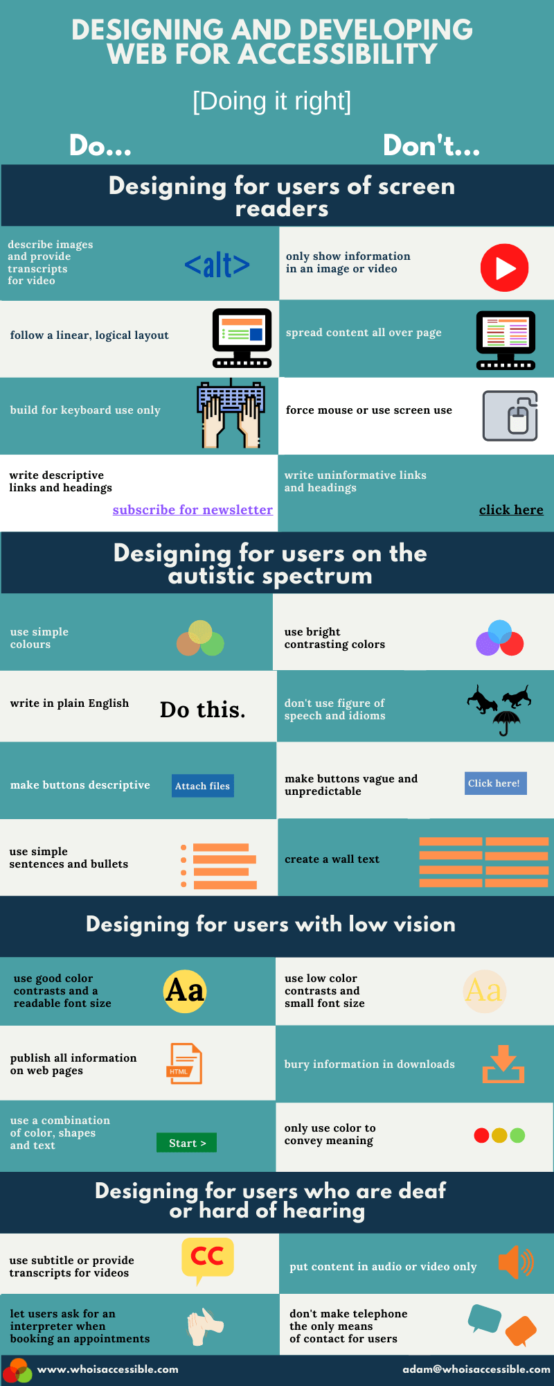
Here is our infographic to simplify and support the above information and to make it more easily accessible to your team.
Description
Title: DESIGNING AND DEVELOPING FOR ACCESSIBILITY [Doing it right]
Designing for users of screen readers
Do: describe images and provide transcripts for video
Don’t: only show information in an image or video
Do: follow a linear, logical layout
Don’t: spread content all over the page
Do: build for keyboard use only
Don’t: force the mouse or use the screen to use
Do: write descriptive links and headings e.g “subscribe for our newsletter”
Don’t: write uninformative links and headings e.g “click here”
Designing for users with autistic spectrum
Do: use simple colors
Don’t: use bright contrasting colors
Do: write in plain English
Don’t: don’t use a figure of speech and idioms
Do: make buttons descriptive
Don’t: make buttons vague and unpredictable
Do: use simple sentences and bullets
Don’t: create a wall of text
Designing for users with low vision
Do: use good color contrasts and a readable font size
Don’t: use low color contrasts and small font size
Do: publish all information on web pages
Don’t: bury information in downloads
Do: use a combination of colors, shapes, and text
Don’t: only use color to convey meaning
Designing for users who are deaf or hard of hearing
Do: use subtitles or provide transcripts for videos
Don’t: put content in audio or video only
Do: let users ask for an interpreter when booking appointments
Don’t: don’t make the telephone the only means of contact for users


